Settings Redesign
The 30+ settings pages in our app had very inconsistent UI and UX. Though a complete overhaul of our settings pages could not be prioritized from the business, a group of designers came up with an updated, consistent design pattern that we have been applying to the app little by little.
Team
Core
- 4 Product Designers
Additional Input and Approval
- Director of Design
- Rest of Design Team (~10 members total)
Problem
Due to the many inconsistencies on our numerous settings pages, users would often have a different user experience from page to page. Sometimes users were confused about how to update certain settings.
Solution
We created a single, flexible design pattern that would allow users to update settings requiring different methods of input. This pattern enabled us to use consistent copy and information architecture for our diverse body of settings.
Personas
Uri the User
Motivations
Uri is a sales representative who is required to reach out to hundreds of prospects a day via emails and phone calls. His work can be stressful, as he has a quota of meetings or demos that he needs to book. Uri wants to set up his personal settings when he first creates his user profile, and hopefully never touch them again.
Example Tasks in Settings
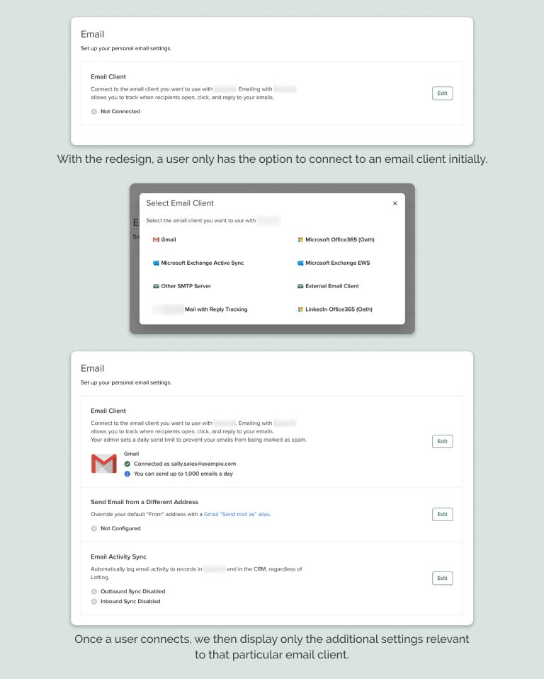
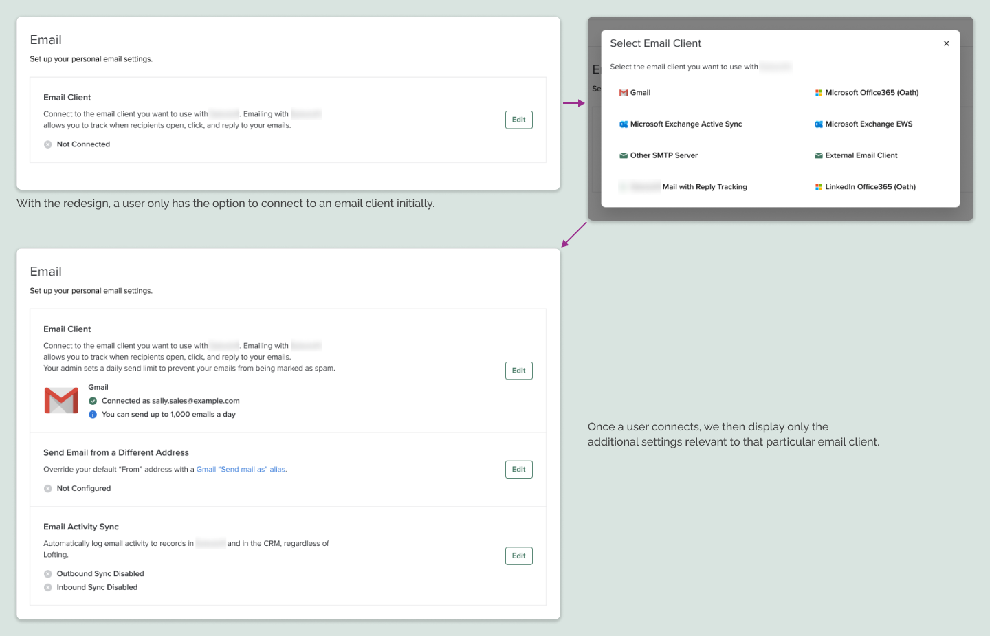
- Select and connect to email client (Gmail, Outlook 365, etc)
- Set up personal dialer and create pre-recorded voicemail messages
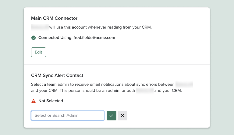
- Connect to personal CRM account
- Set up personal calendar
Adam the Admin
Motivations
Adam manages the different software that his sales team uses. This could be several applications, depending on the size of his company and team. Adam is in charge of team-wide settings that can help or hinder his team. Some of Adam’s work can be very technical in nature, so he wants clear explanations and instructions on how to properly enable more complex settings. Because Adam is working in different applications, he wants to be notified when there are errors in a given app.
Example Tasks in Settings
- Determine what email clients (Gmail, Outlook 365, etc) are available and how many emails a user can send in a day
- Purchase and assign phone numbers
- Connect to his team’s CRM and determine what kind of data is synced between the two applications
- Create unique roles and permissions for different members of his team
Connie the Customer-Facing Internal User
Motivations
Connie can be a support agent, a customer success manager, or in professional services. Connie spends her day interfacing with customers who are encountering issues with the app. Whether it’s through support tickets or video conference calls, Connie listens to customer questions, then walks them through steps on how to address their issues. Connie often encounters customers who are upset and want their problems solved as soon as possible.
Example Tasks in Settings
- Help admins set up custom, non-standard email clients
- Purchase and provision phone numbers for international cities that require extensive documentation
- Search through CRM sync error logs to determine why data isn’t properly syncing
- Set up complex automation rules to trigger actions based on certain events
- Assist large sales teams in importing hundreds to thousands of people or account records
Problem
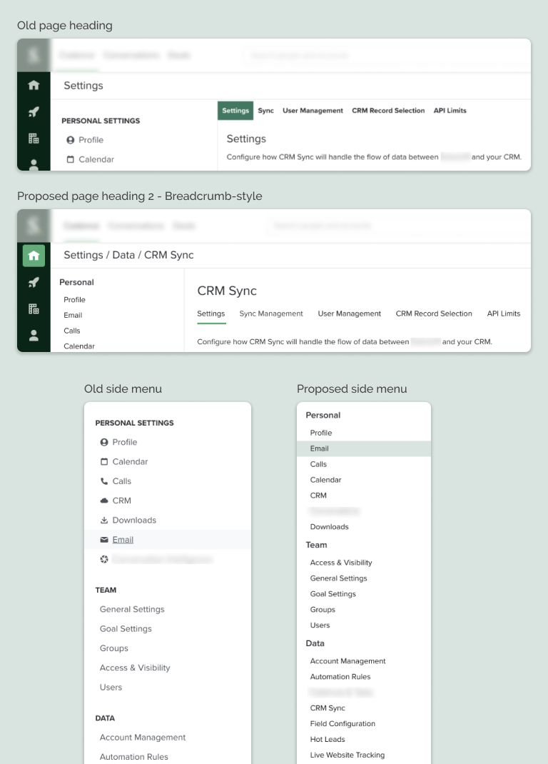
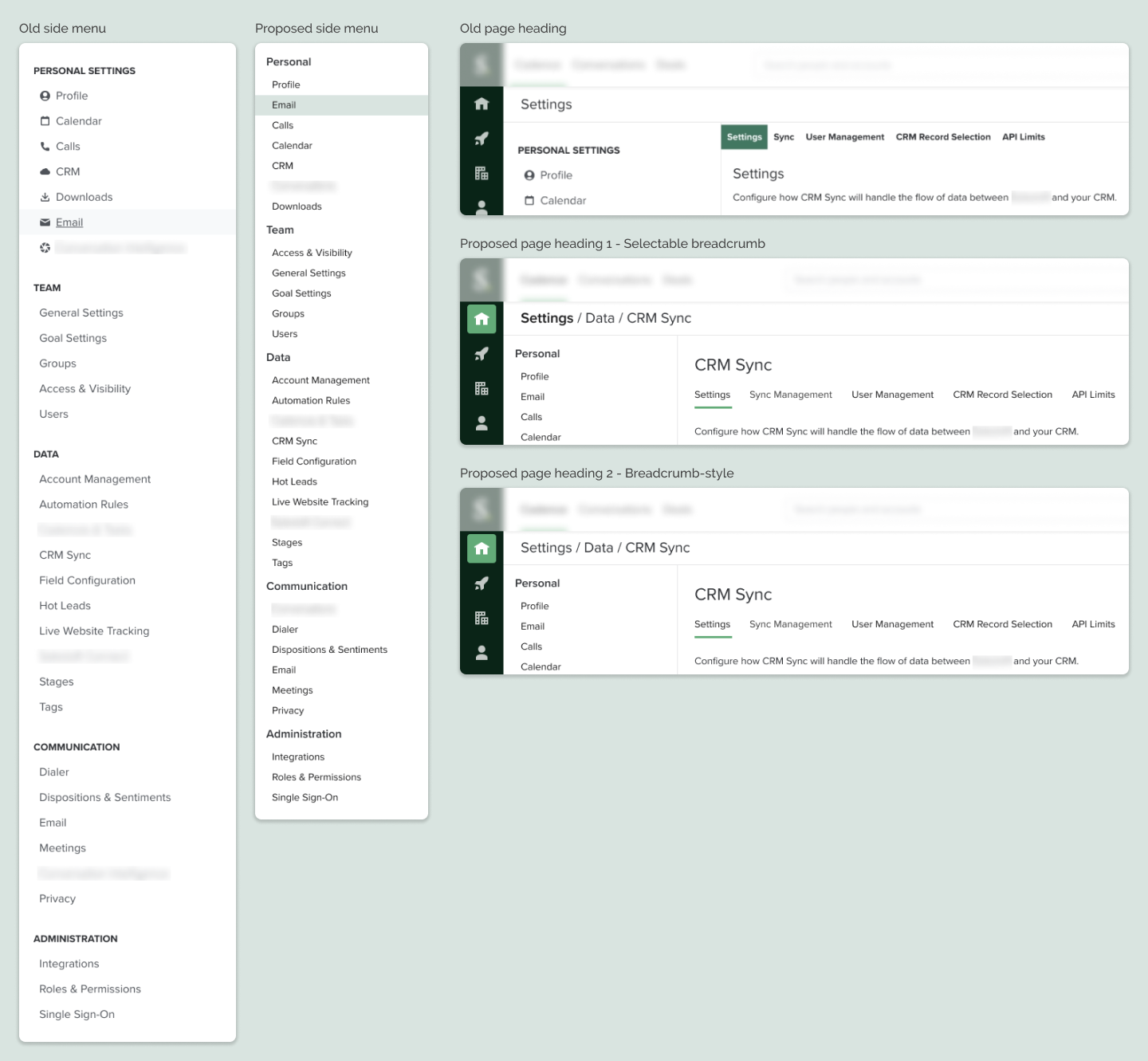
Inconsistent UI
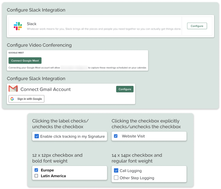
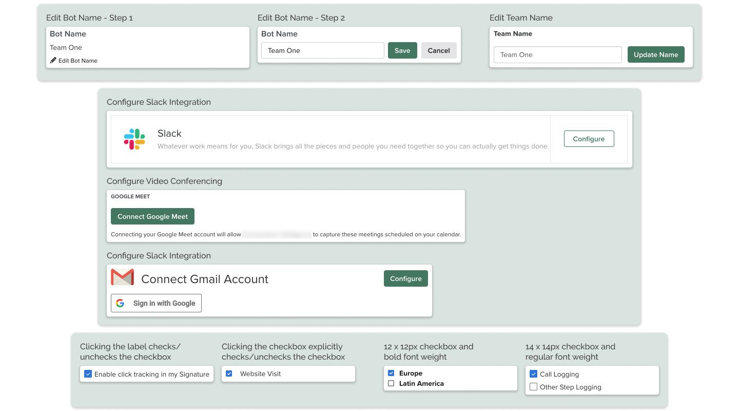
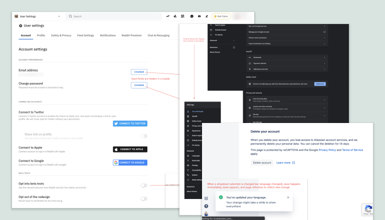
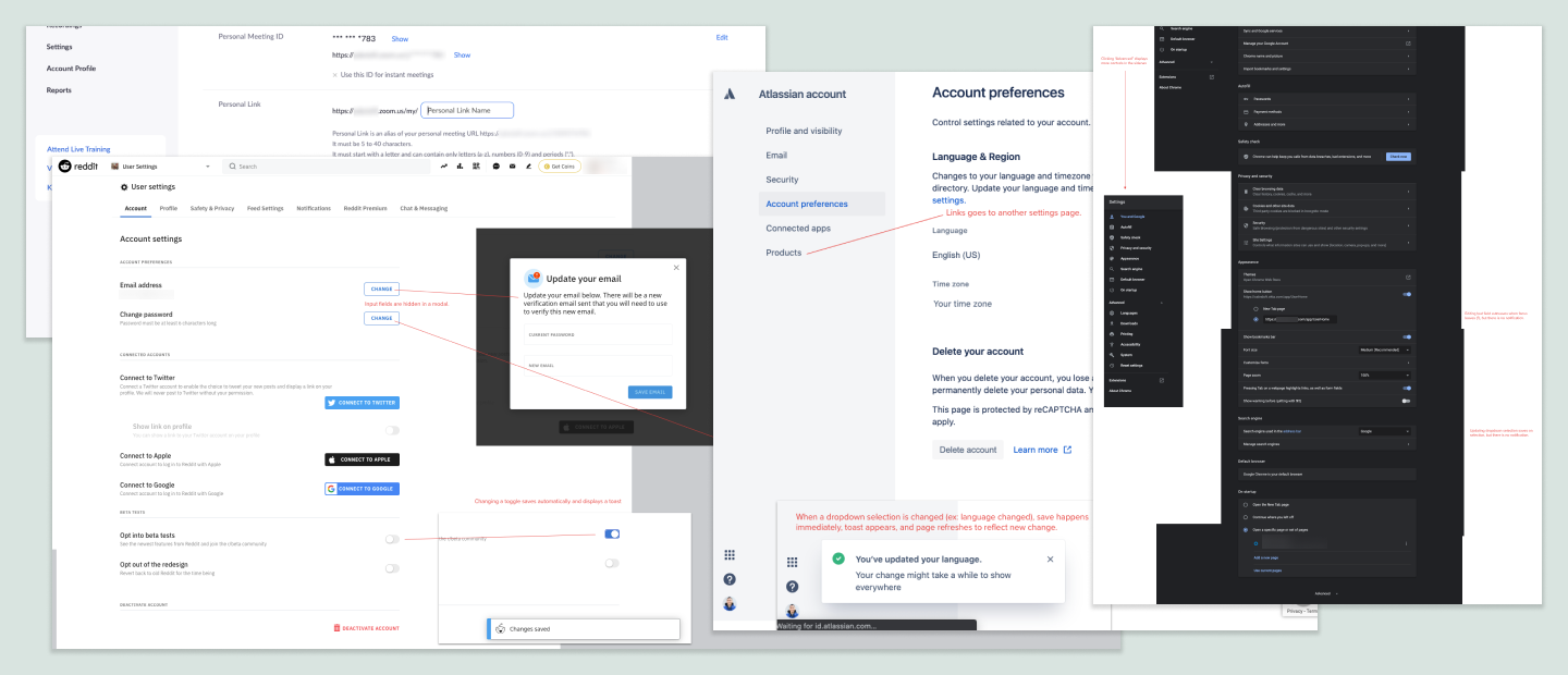
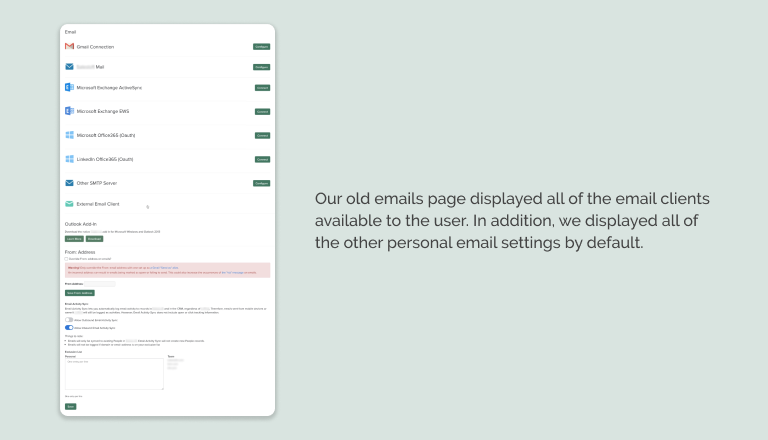
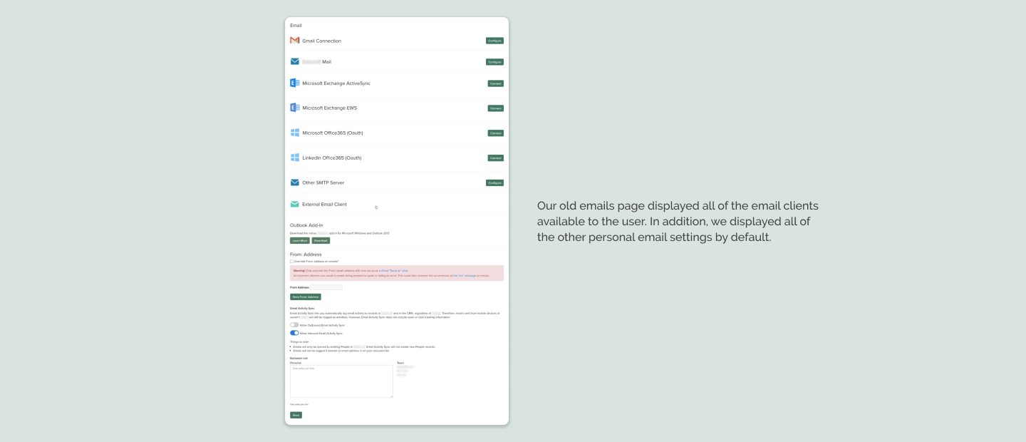
Standard users have access to seven different settings pages, while admins have access to 24 additional pages, several of these with multiple tabs. Many of these 30+ pages were built by different teams at different times, so there are many inconsistencies in the UI and information architecture. Font styles for page titles, subsection headings, and field labels vary as do the tone and language for microcopy. In addition, older pages may use styles and UI components from an older design system while newer pages use new components that look and behave differently (for example, checkboxes with labels may differ). In short, a user may have a completely different experience from one settings page to another, making it confusing and more time-consuming to complete their tasks.
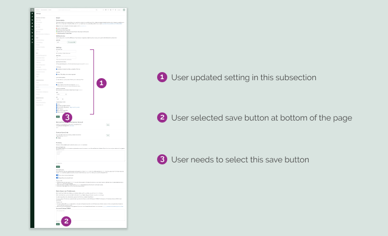
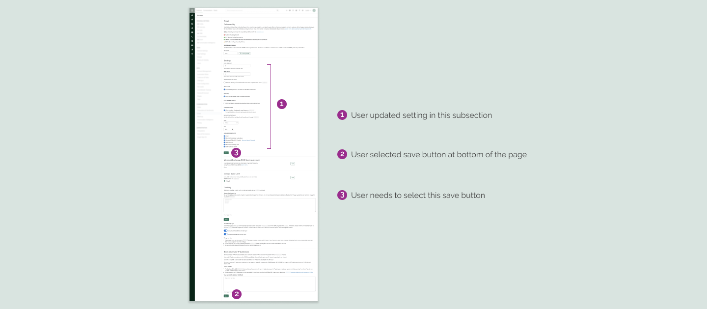
Inconsistent Saving Pattern
Along with the aforementioned inconsistencies with UI, some settings have different mechanisms for saving, even if they involve the same user input. For example, some select inputs and checkboxes trigger a save automatically once they are updated, while other select inputs and checkboxes require the user to click a save button.
In one extreme example, there is a page with three subsections, each with its own save button. An internal user from professional services was struggling to help a customer who wanted to update a given setting in the first subsection on the page. Both the customer and internal user were updating the setting, then scrolling to the bottom of the screen to select the save button for the third subsection. The setting was not updated because both users were scrolling past the relevant save button for the first subsection. In their defense, the three subsections are not clearly delineated.
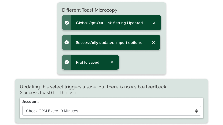
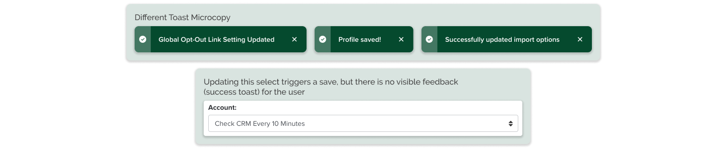
Inconsistent Feedback
Though some settings provide users with clear error messaging, some do not. For the latter instances, it is challenging for users to identify why the app is not performing as expected. To continue the discussion of inconsistent saving patterns above, though many settings trigger a toast (flash) message when updated, some settings do not. In these instances, it is unclear to users if their recent changes have taken effect or not.
Process
Comparative Analysis
The four designers working on this project spent time looking at other applications and websites to see how they managed their settings. I looked at a number of apps that my company used including Jira, Atlassian, Zoom, Google Suite, Slack, and more. I took screenshots and documented different interactions that stood out to me.
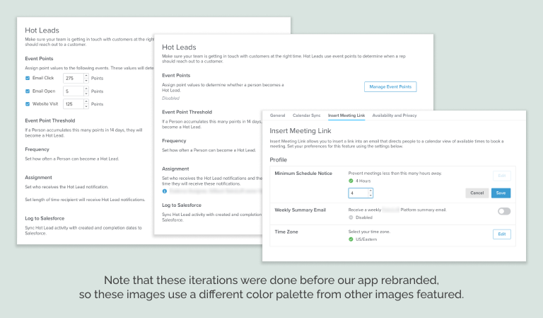
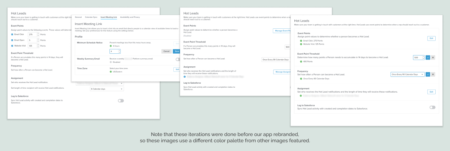
Iterations
The team of four designers shared our comparative analysis findings and discussed what elements we liked from different applications. We discussed the problems with our current settings pages and came to a general agreement on what we wanted to address and improve. We then separately worked on designs for updates to different settings pages. We each chose pages with which we had some familiarity, and made sure that we included the different types of inputs found on all existing settings pages. We met weekly, sharing our designs and giving each other feedback. We continued to refine our designs as we were inspired by each other’s work and our weekly reviews.
Solution
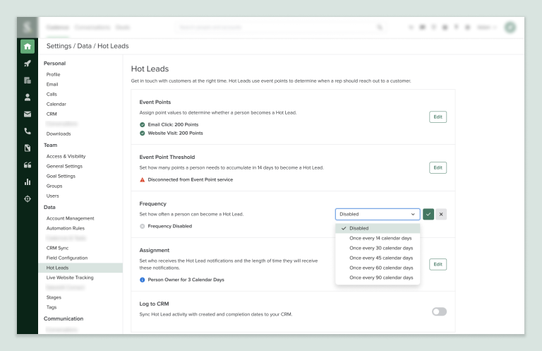
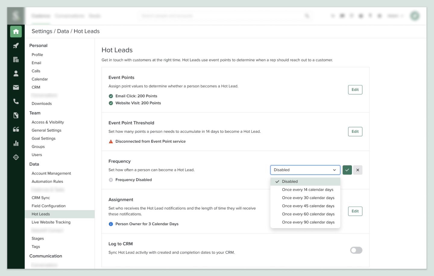
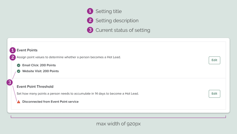
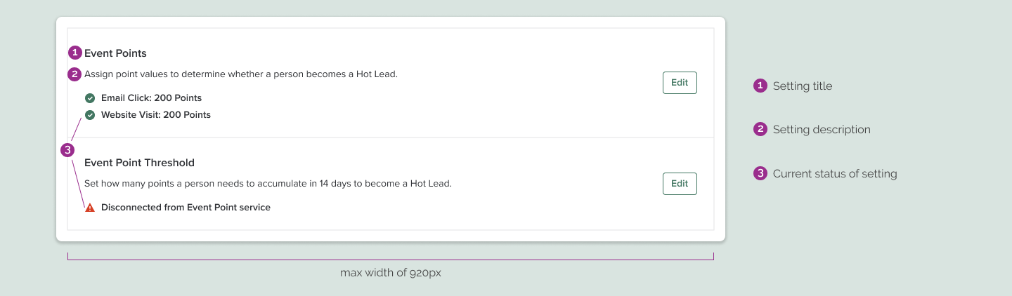
Single, Flexible Pattern
We agreed upon a pattern where a given setting is contained in a box with an outline to clearly separate it from other settings. This container includes a title, a description, the current status of the setting (if applicable), and an element for the user to interact with. This pattern enables us to use consistent microcopy, especially for the setting status and edit button. We are also able to support different input methods with this UI. We apply a max width to the container, so that the interactable element won’t be too far from the microcopy on larger monitors.
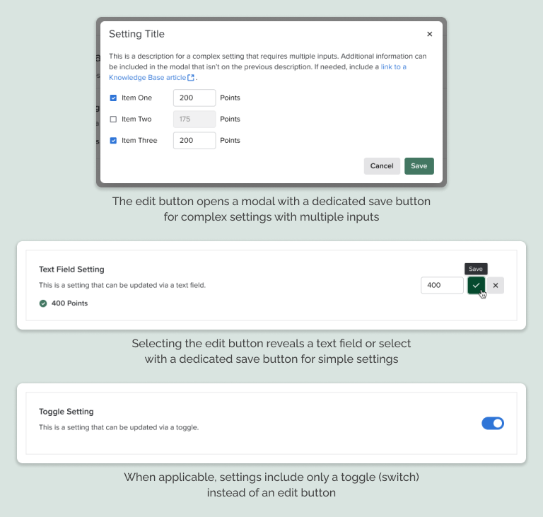
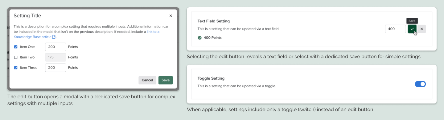
Saving
Selecting the save button from modals or inline editing for text/select fields triggers a toast. Enabling or disabling a toggle also triggers a toast, providing users with feedback. These toasts typically say “[Setting name] Updated,” though exceptions can exist.


Reducing Cognitive Load
In an effort to simplify our pages and reduce cognitive load, we propose progressive disclosure when appropriate. If a setting or settings require another setting to be enabled as a prerequisite, we only show the dependent setting(s) if the initial setting is enabled.
Responsive Design
Though we are not an explicity responsive web application, knowing that sometimes our users work on small monitors or decrease the width of their browser windows, I created designs for how our new pattern will behave at smaller resolutions.
Final Thoughts
Reception and Implementation
Because this project was initiated by the design team vs. being a product feature, we did not gather metrics to measure success. We have received very positive feedback internally from internal users and even developers who have built this new UI.
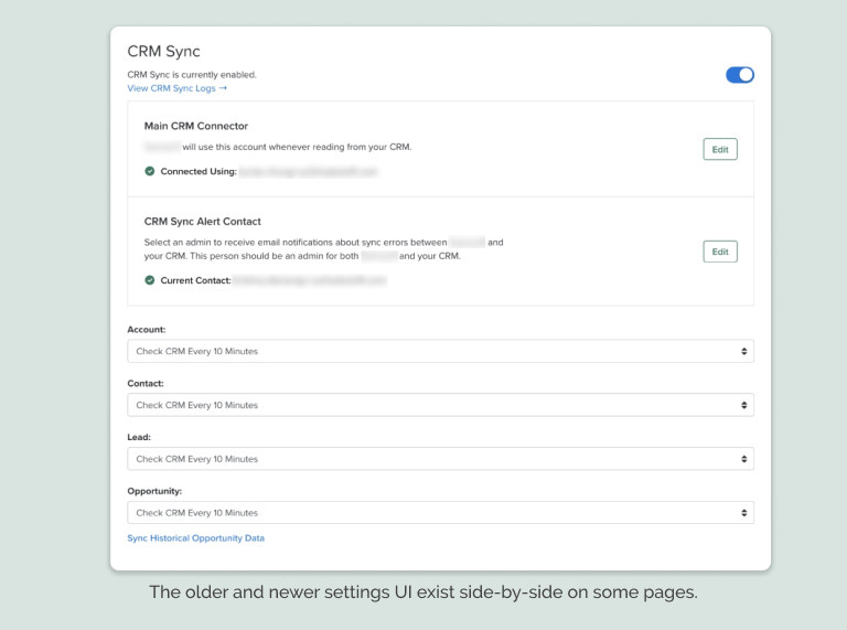
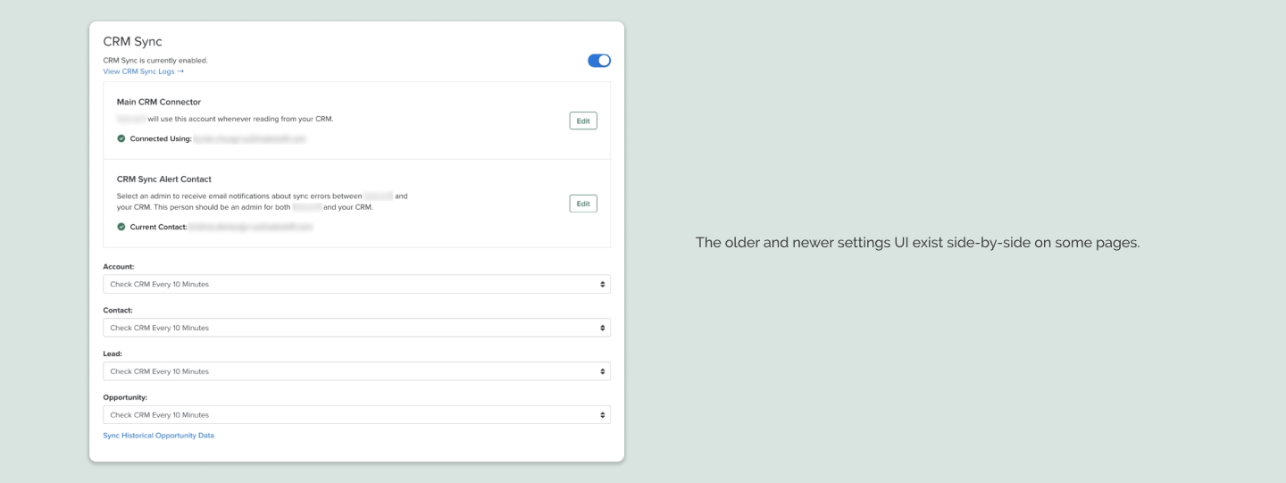
It is also worth noting that due to the number of our settings pages and other business priorities, we are still in the process of implementing this new design pattern. Most of our settings pages still have the older, inconsistent UI. However, whenever we implement new settings, we use the new pattern. And we are currently in the middle of an ongoing initiative to rebuild a lot of the older pages in our app, so we have been applying this new pattern whenever the opportunity arises, little by little.
Future Considerations
The team of designers working on this project have other improvements that we have not been able to implement in the app.
Other Improvements
- decrease the width of the settings side menu to accomodate the longest list item, but provide more room for the main content
- use breadcrumbs or a breadcrumb-type info architecture for page headings to make it clear to the user where they are
- reorganize or consolidate the number of settings pages as 30+ is a lot
- make settings more accessible via keyboard-only interactions, semantic HTML, and proper labels for screen readers