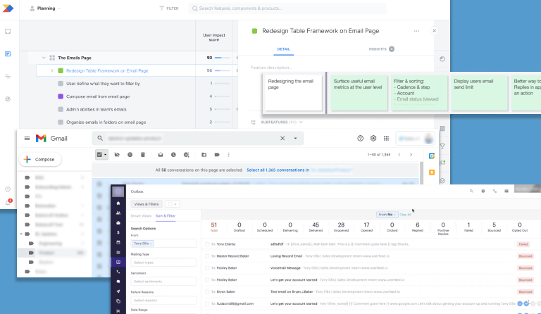
Emails List Redesign
As part of a department-wide initiative of refactoring Angular code to React, our scrum team was tasked with rebuilding our emails list view. We improved the design and user experience of the page based on user research instead of simply recreating existing functionality.
Team
Core
- Product Designer
- Product Manager
- UX Researcher
- Software Architect
Additional Input
- Design Team
- Scrum Team
Key Stakeholders
- Director of Design
- Senior Manager, Product
Stages
- Gathering Requirements
- Comparative Analysis
- UX Research
- UX Research with Screen Mockups
- Design Iteration
- Final Design
Hypothesis
We knew that users were navigating to this page as it was the 7th most visited page in our application at the start of our project. However, we theorized that users did not find this page particularly useful due to the limited number of possible actions available.
Goals
We wanted to understand what users did on the page in its previous state and redesign it in a manner more suited to their needs. Specifically, we wanted to provide a clearer presentation of information and useful actions including filtering.
Research
Existing Functionality
I spent time experimenting with and documenting existing functionality of the emails list with notes and screenshots. I wanted to make sure we didn't take away any helpful actions or positive UX with our redesign. I took special care to test scenarios to see how we handled errors.
Productboard and Comparative Analysis
My Product Manager (PM) and I looked through requests for the emails list in Productboard, our main intake system for user feedback. We read 93 different pieces of feedback and took note of the recurring themes and requests. I then performed a comparative analysis of email lists in other apps, including one of our major competitors, to see the design and actions they offered.
User Research
Next, my PM and I collaborated with a UX researcher to prepare a research plan. We prepared questions for live interviews, and the UX research team recruited external users from two main personas, sales reps and sales managers. In our first round of interviews, we conducted six interviews. Many users struggled to answer our questions as they weren’t sure what they wanted or wanted to do on the emails list.
I mocked up some screens with a few different design variations of the page. My PM and I then conducted four additional interviews where we started with the same open-ended questions we asked in our initial interviews. Then we showed the users our mockups. This helped the users provide more concrete feedback about what they did and didn’t want on this page.
Explorations
Research Synthesis and Explorations
My PM and I evaluated the responses from our interviews along with the existing Productboard feedback. After agreeing upon what functionality users seemed to want the most, I designed some drafts for the emails list redesign. The software architect for our scrum team provided feedback on technical concerns and constraints. The design team provided additional feedback on the visual design, usability, and any variations I might be introducing to existing design patterns in our app.
(Possible) Future Versions
Though we interviewed sales reps and sales managers, the majority of our user base are sales reps. We decided to cater to them for our initial redesign. However, I designed additional functionality based on the requests of the managers we interviewed. These additions were designed in such a way that they could be built upon our base design.
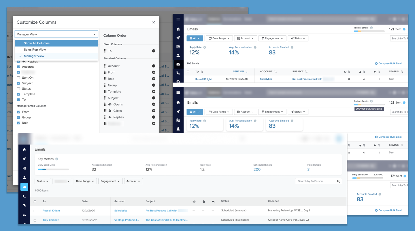
I also designed additional functionality and email-related analytics for a future state. Though our app has an entire section dedicated to analytics, these dashboards and reports are most often viewed by team admins and managers. My PM had a vision to provide email-specific analytics to a given user on the emails page. Unfortunately these analytics were descoped from the project due to time and resources.
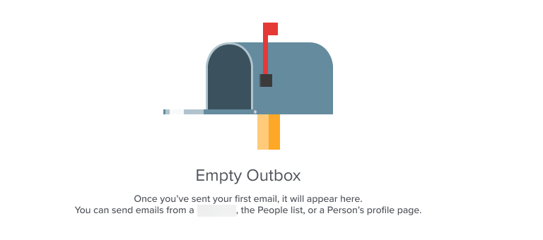
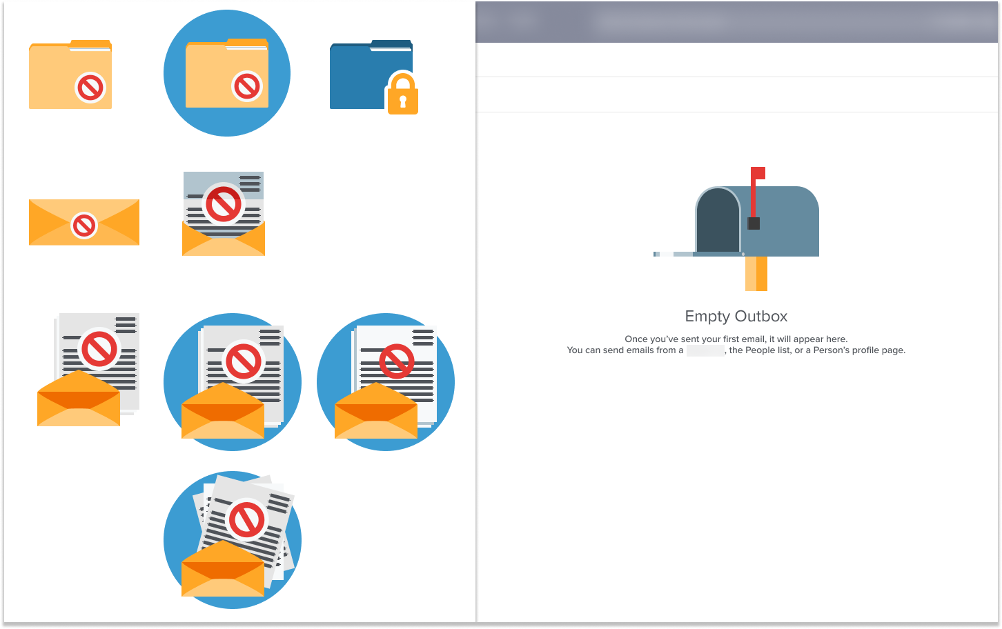
Empty State
Our app used simple empty state images, which were often enlarged icons. Another designer and I had a vision to increase the visual appeal of our empty state illustations. (See Empty State project) While redesigning the emails list, I took the opportunity to create a new vector illustration for the empty state.
Final
Consistency
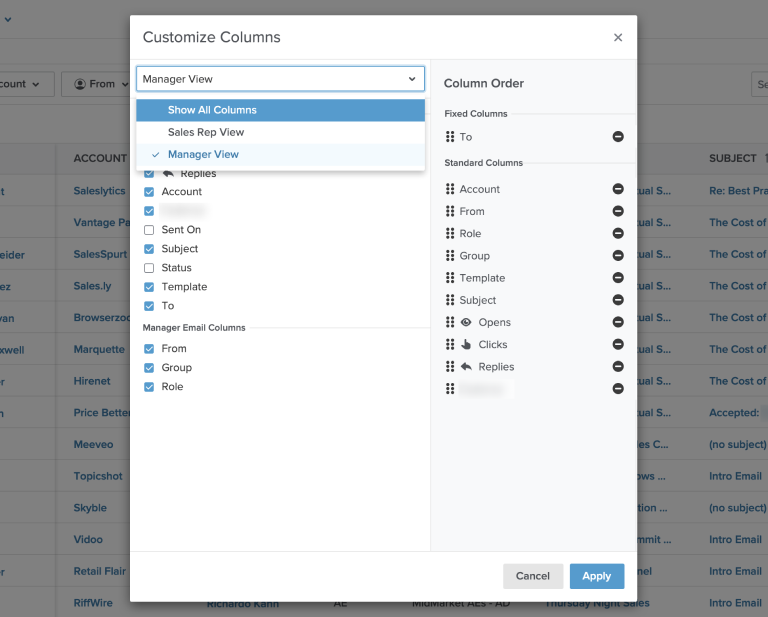
Before the redesign, our emails list used an older table component. For the redesign, we used a React table component that was used on other pages in our app. This provided a more modern UI as well as a more consistent experience for our users.
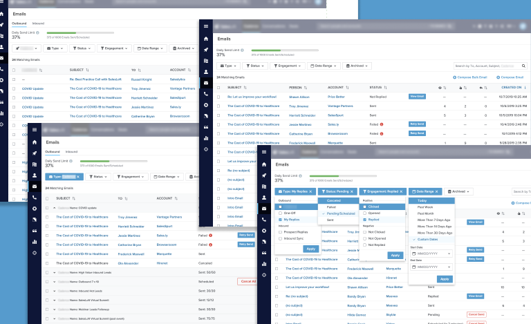
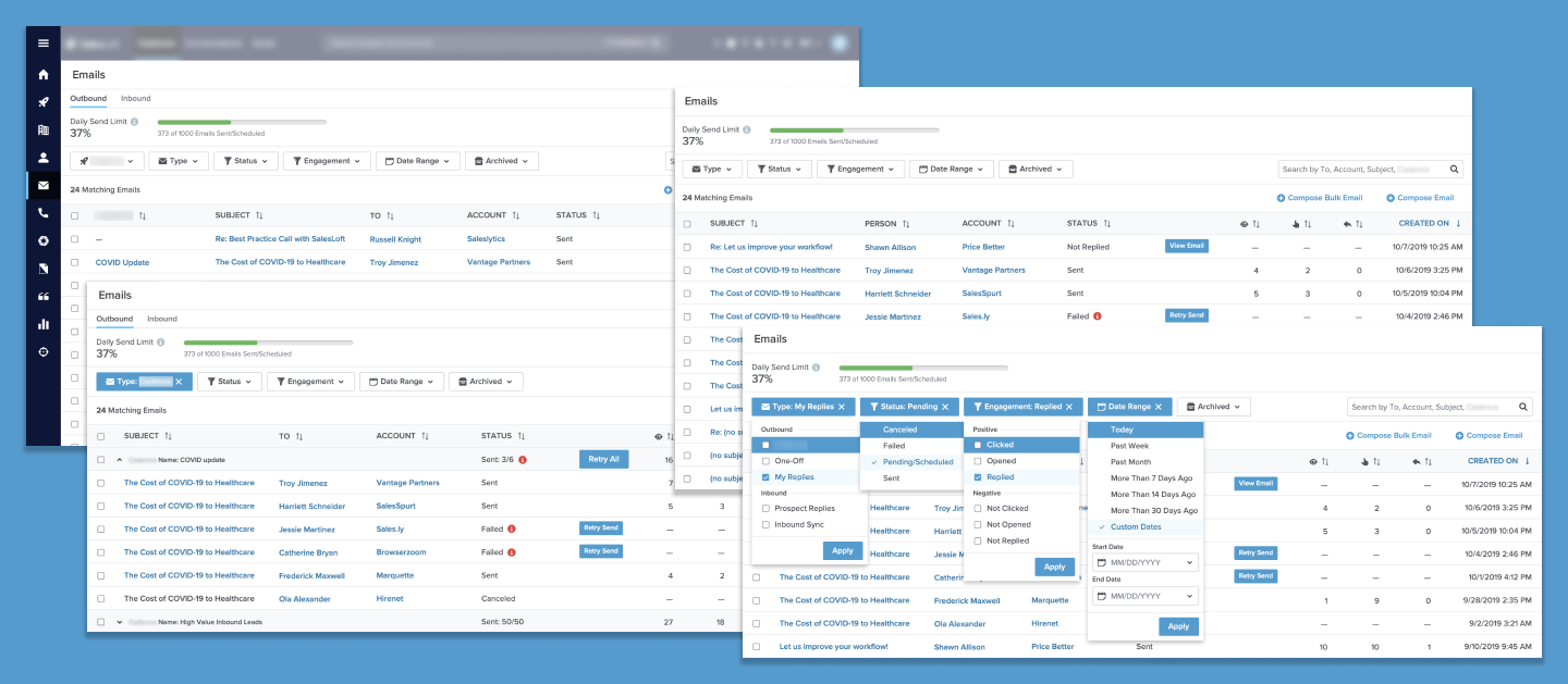
Displaying Emails
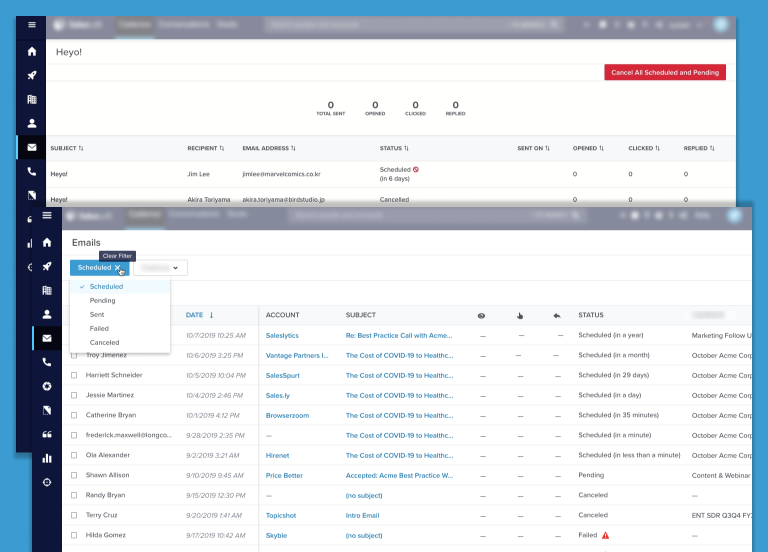
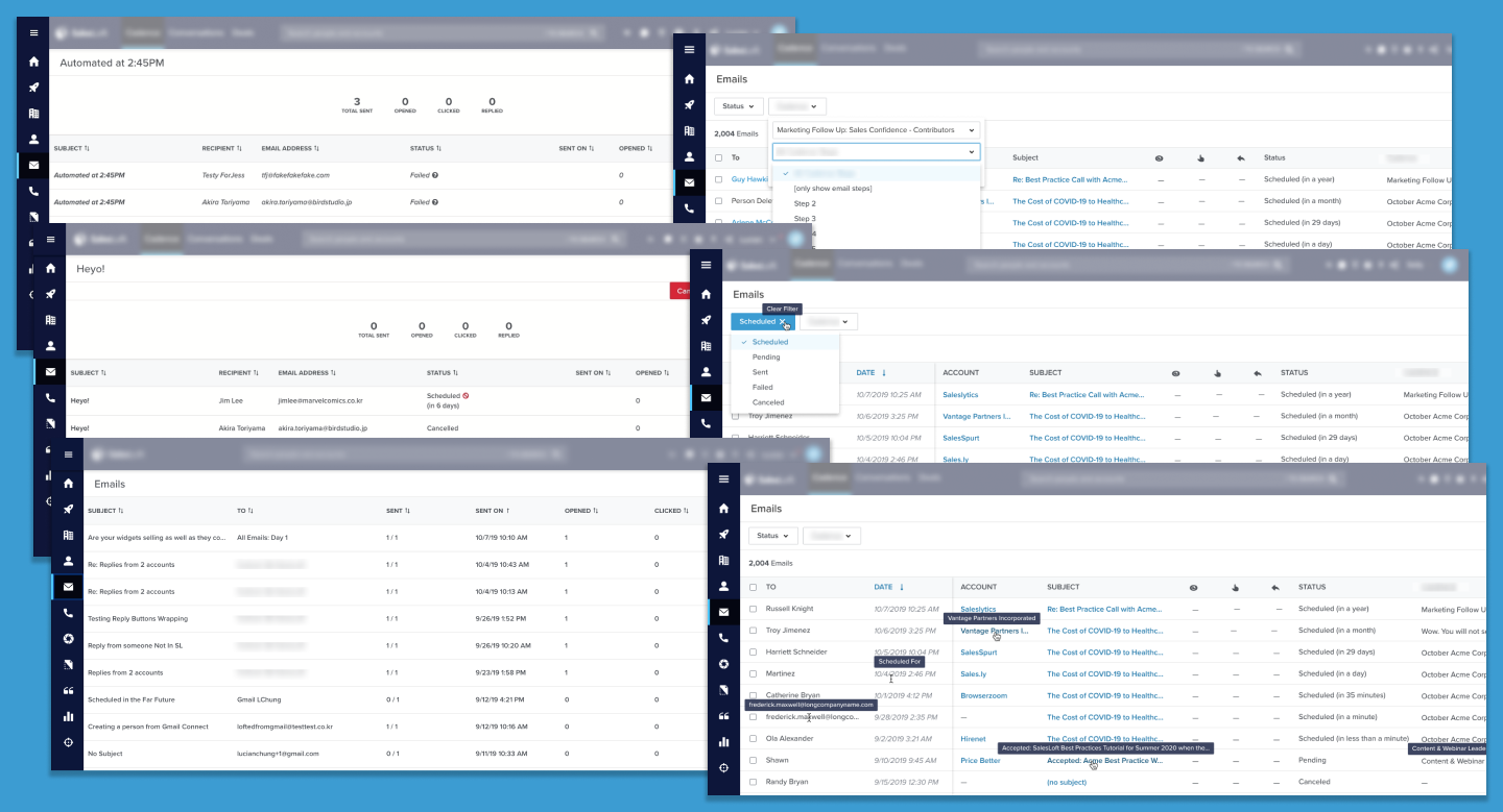
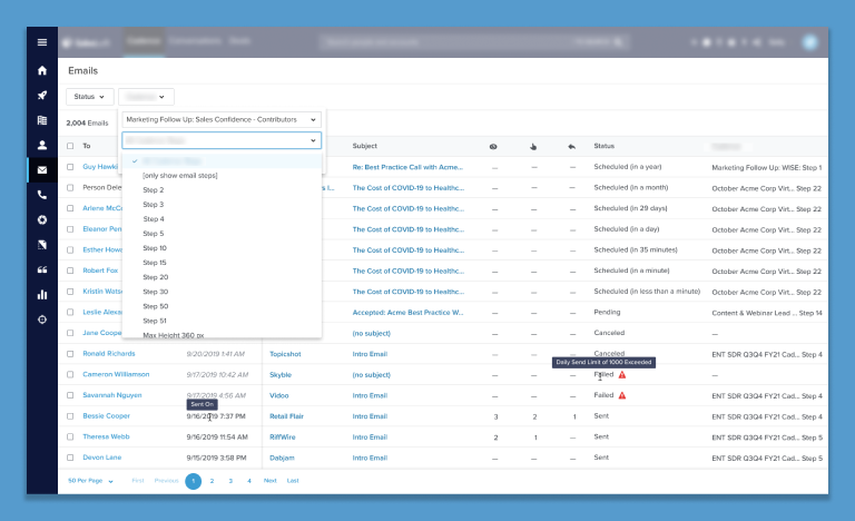
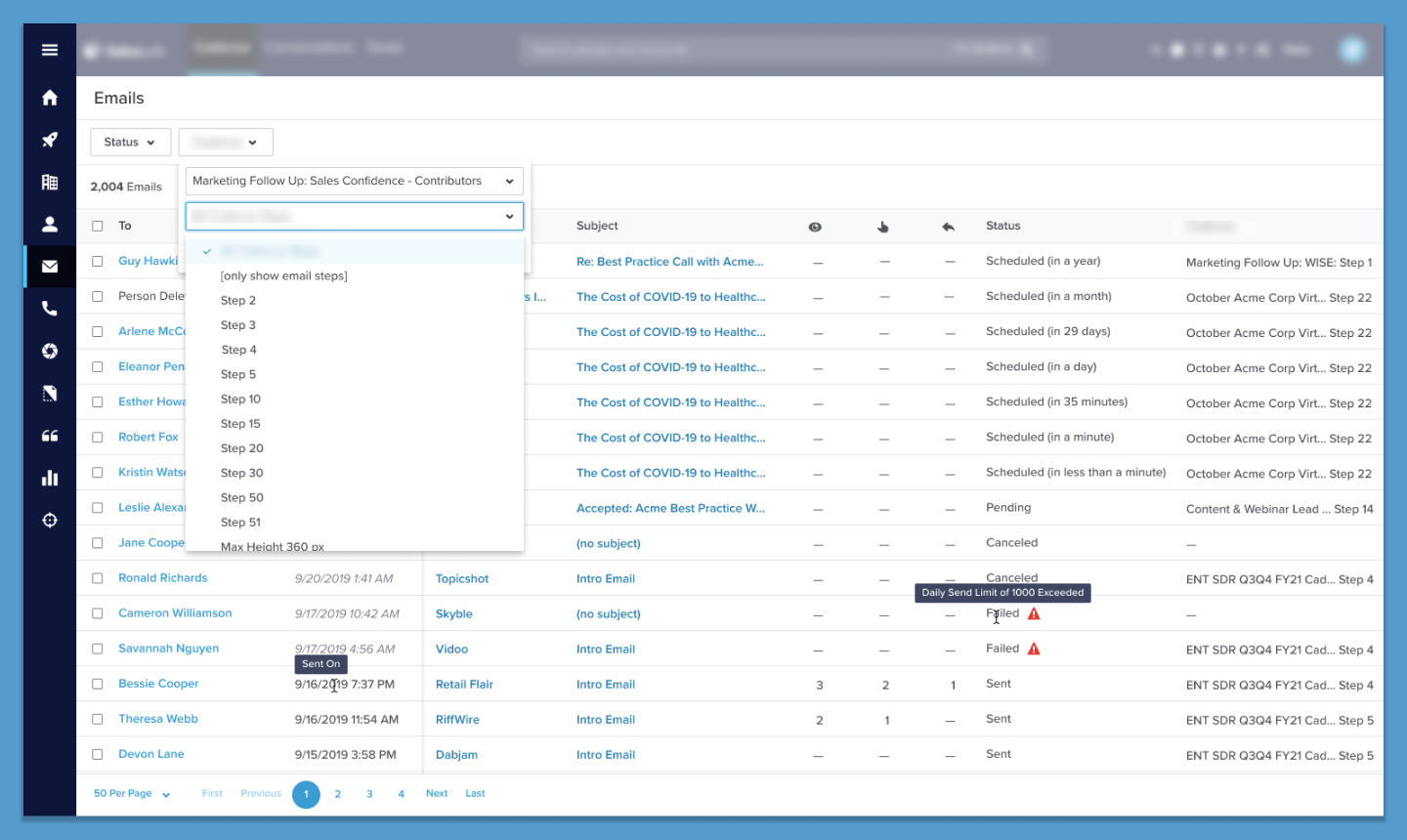
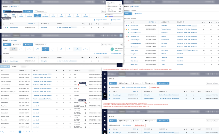
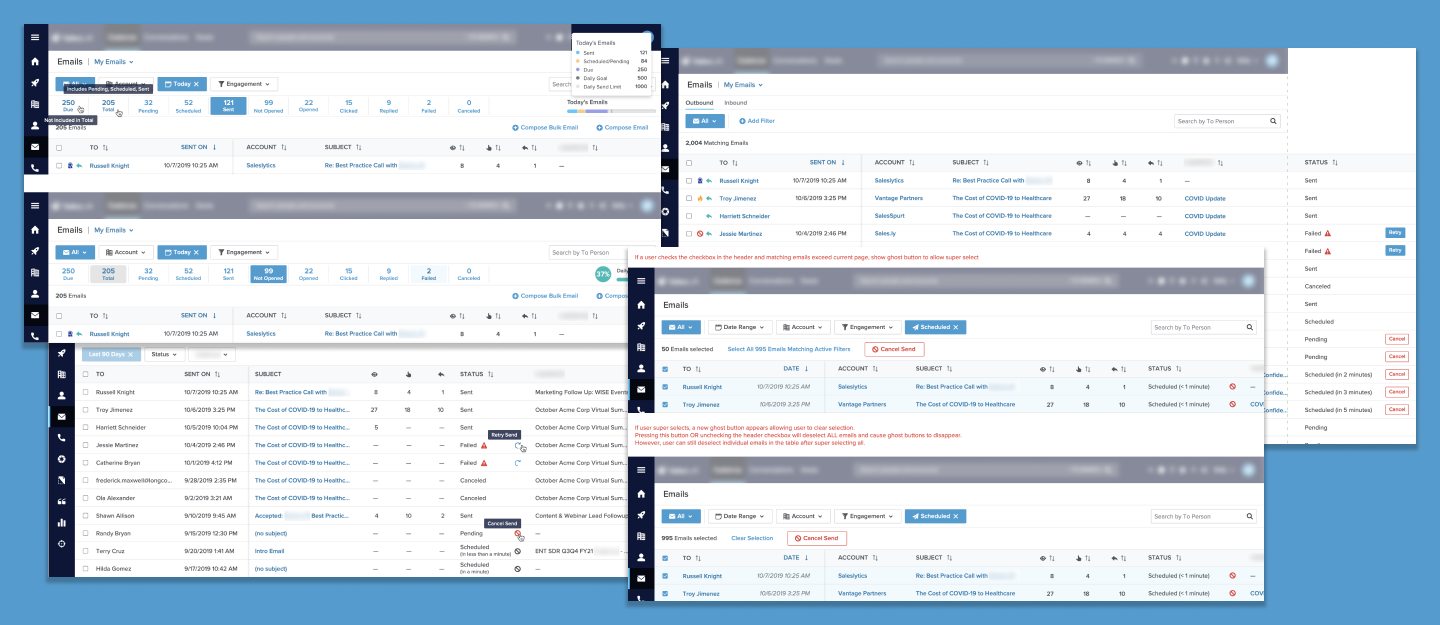
Our old emails list was structured so that when a user sent a batch of emails with the same subject at a similar time, these would appear as a single item on a row. The user would then have to select that row item to view the individual emails in that batch. Individual emails were also grouped into a batch of one, so a user would have to select the batch of one, and then select the lone email again to view it. Our research confirmed that this was a confusing experience for our users. For the redesign, we displayed each email individually, but added a filter to enable users to view emails by batches.
Canceling Emails
Previously, if a user wanted to stop a pending email from being sent, they would have to find the exact email batch first, then select the individual email(s) they wanted to cancel. This required the user to know the exact subject line and time that they sent the email. For the redesign, we gave users the ability to filter by email statuses. Now a user can use the filter that is always on the top of the page to filter by pending emails, select any desired emails from the filtered list, and cancel the send.
Other Enhancements
We made other enhancements by adding new columns detailing the recipients and associated accounts for emails. These recipient and account names are hyperlinks to allow users to easily navigate to respective profile pages. We also updated the “Sent On” column to the more general title of “Date” with tooltips on hover to more accurately describe the “Scheduled For” date for scheduled emails or “Updated On” date for failed and canceled emails.